


For this fall’s NACIS conference (the North American Cartographic Information Society), I’m proposing a talk along the lines of the ideas I introduced in my last post—the relationships between musical and geographical space, and what those relationships mean for “mapping” both in parallel. Below is a brief recap of those ideas followed by some of my early experiments in applying them to The Last Island, my orchestral composition that started me down this “musical cartography” road.
Both visual and musical depictions of a geographical/environmental “journey” involve travel through time, as well as through space in the sense that the music “picks up” and plays back characteristics of that space as the sound moves through it just as paint or photography does for the eyes. Last time I used a 3D model (shown again below), incorporating a hypothetical musical version of the ecological journey I’ve depicted in my watercolor Divide, to illustrate this structural relationship. The third dimension is represented by the height of the printed score, and certain musical elements that have a “vertical” component. So the main difference between the two mediums isn’t that music is temporal while painting is spatial; it’s that the musical journey is completely “directed,” a one-dimensional path that winds through two dimensions whereas the path of even a “linear” visual journey is itself always 2D to some extent.

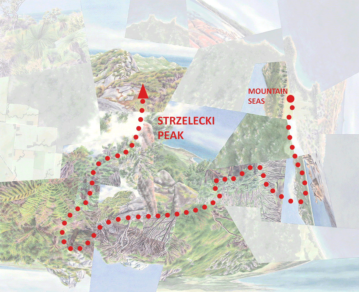
Obviously I’ve had a long interest in these journeys generally, which has led to most of my latest worldviews plus most recently The Last Island (which became a multi-media project but began as a solely musical representation of an imaginary island ascent). I’ve been experimenting with methods of “mapping” the piece along with the visual/geographical elements that it’s meant to evoke, in terms of both overall structure and more detailed elements. The goal, both for my own enrichment and possibly for this conference talk (if my abstract is accepted!), is to find out 1) which of those methods best illustrate how the different elements of each medium shift along the journey, and 2) how well those shifts parallel each other given that I wrote the music without the intention of lining it up with any visual imagery. The results aren’t very digestible yet, and so this post is mostly a way to mark some progress and to give an overall sense of how cartographic/design thinking might be applied to music in a very methodical, detailed way. I’ve been working on a series of diagrams (“linear maps”), a selection of them shown in the image below. Skip down to that if you’d like just a quick sense of what I’ve been up to, taking from it what you will, but keep reading if you’d like to get a bit more deeply into the weeds with me….
Overall Setup
Analogous to the 3D model from last time, the sheet of diagrams aligns environmental, painted, and musical elements built up upon each other in that order. Though I broke the rules by adapting the painted elements to the music rather than the other way around, you can think of this ordered layering as representing an “order of operations”: environmental elements (in this case imaginary) inspire the painted representation which in turn inspires the musical representation. (Given the length of the diagrams I’ve oriented the image vertically; from here on I’ll be referring to top, bottom, left and right as if you were looking at the sheet horizontally).
So why no 3D model this time? As I explained last time, The Last Island doesn’t actually lend itself so well to a 3D representation, given that a 2D visual version (a painting/worldview) of that particular island journey doesn’t exist—I can’t show it as a curvy visual/musical path through 2D visual/geographical space. Instead the visual component is just a linear sequence of images taken from many different worldviews, strung together after the fact for the multi-media video, representing a straightened-out and “deconstructed” version of what would otherwise be that curvy path. Technically I could still build a 3D model using that linear sequence—it would just be a very skinny 2D “plane” without any meaningful component of width—and I might still end up doing that at some point in order to clearly distinguish between horizontal and vertical and for another reason I’ll mention below. But since I haven’t done that yet, note that on the sheet:
The environmental elements in the bottom half, like the painted elements, are each represented by linear bands. In a 3D model they would each appear as a different component of that skinny horizontal 2D plane, separated out. (It would probably take multiple models to illustrate clearly.)
The bands representing musical elements are abstractions of the printed musical score— components of the vertical dimension in a 3D model (like in the generic example from last time), separated out.

Environmental Elements
These include the following from bottom-up, arranged to represent a sort of (very simplified) “order of operations” like I described for the sheet overall:
Elevation
Rainfall (a function of elevation)
Heat (also a function of elevation)
Tree Cover (a function of heat/rainfall). I could’ve also called this “biomass” or “plant density”; if I were being scientific about it I’d probably break it into several different elements.
Landscape (or ecosystem; a function of all the above). I’ve divided this into “foreground” and “beyond,” applicable to the painted images that include a view into the distance or represent a “mental detour” (more on that later). Though I haven’t labeled it on the diagrams, all of the elements above also incorporate these “foreground” and “beyond” components where applicable.
Painted Elements
Each individual landscape in the sequence of paintings is sized according to its duration in the video. This does make most of them too small to read—you’ll just have to watch the video again!—but it’s the result of equal space intervals representing equal time intervals. (If I ever turned this sequence of images into a 2D worldview I would need to consider whether to size them in the same way relative to each other—in the watercolor compositions I do typically size the fragments based on their psychological “salience” but there are many more factors involved than the amount of time “spent” in each landscape. This also raises the issue of this being way too many images to fit into one painting; it’s another result of having put the imagery together after-the-fact, wanting to make sure the video imagery keeps moving.)
Musical Structure
I’ve labeled the two music-related diagrams as musical “elements,” though they aren’t elements so much as larger components or devices that organize other elements within.
Paths. I mentioned that music, unlike visual representation, restricts experience to a single path through space (and of course time). And though that 1D path may wind through 2D space, in the case of the The Last Island that “space” is also just a 1D (linear) strip of imagery. But as I began to ask in the previous post, could multiple musical paths progress at the same time, evoking 2D space even if each path is itself straight/linear? What if The Last Island didn’t just depict one journey but two simultaneous journeys, or—more nuanced—one journey that jumps back and forth between two (or even more) different paths, suggesting a physical journey interrupted by “mental detours” to another place? Or more accurately, a mental journey (since none if this is really “physical”) interrupted by “meta-mental detours”? (This all raises of who is actually doing the “journeying”—is it the listener or is it someone imagined by the listener? Or multiple someones in different places? I won’t get any more caught up in this now, but I think it’s either a fascinating question or a silly one.)
I didn’t think about this idea of multiple paths in a very methodical way while writing The Last Island. But there are certain zones where, based on sufficient “divergences” in some combination of elements (key, register, instrumentation, pitch, and possibly others), parts of the score could be thought of as splitting off from the rest to evoke a different place. Generally that place is actually forward or backward on the same path, suggesting the imagining of places to be visited (anticipation) or places already visited (memory), rather than a different path “off to the side.” But I think that’s overthinking it (if all of this isn’t already over-thinking); the concept of spatial “thickness” is the same.
In the Path diagram, these anticipation/memory “detours” are represented by the light rows of arrows, and the divergent paths are in dashed boxes. Sometimes those paths are made up of certain layers in the score, and at other times all layers; the mind is either partially or completely “wandering.” The heavy dashed lines show how these “tears” in the path align with parallel shifts in the painted and environmental elements. Picture the paths in the dashed boxes as receding into background, and the painted/environmental elements between the dashed lines as shifting over, per the horizontal/vertical distinction I had to clarify earlier given the lack of a 3D model. (This is the case I alluded to where that model would have been useful.) Also note the lighter dashed lines and darker rows of arrows labeled “view ahead.” These demarcate distant places, again forward or backward, that are actually visible from the main path so that they don’t require “mental detours” of the same degree. In these cases there’s no break in the path.
Theme. Writing The Last Island based not on a particular worldview, but still inspired by the idea of environmental edges and contrasts along a journey (rather than continuous, imperceptible change), I divided the piece into into discrete sections each identified by one of two themes defined mostly by melody (a combination of pitch and rhythm) but with a harmonic component as well. The choice of two themes, rather than a different one associated with each successive ecological zone, frankly had a lot to do with having had two pre-conceived themes already in my head; but, it also meshed well with my interest in the wet-dry dichotomy in particular. With that starting point, and at the same time also wanting to depict the more ecologically complex experience of an island ascent, I landed on the idea of “mental detours” and distant views that I described above: “traveling” psychologically back-and-forth multiple times between dry (Theme A) and wet (Theme B) places in the midst of an “actual” linear journey inland and uphill. It’s that underlying, continuous inland/uphill journey that makes the themes different each time they return, inflected or overlaid by any number of musical elements that evolve through space and time without obscuring the thematic identities.
These musical “zones,” defined by clear edges and contrasts, then informed a largely parallel ecological zonation pattern in the sequence of images, and in turn the diagramming of ecological elements that would produce the landscapes in those images. Again, this inspiration went in the wrong direction and I didn’t write the music with the intent of slavishly adhering to a visual or physical precedent. That’s why the boundaries between thematic and ecological zones don’t always line up. It also explains, partly, why from about 7:30 onward the association of Themes A and B with dry and wet respectively breaks down. But there’s a conceptual justification too. Aligned with the dry forest zone between about 6:30 and 7:30, transitional between dry and wet, the two themes overlay and become confounded in the process, losing their respective dry and wet associations for the remainder of the piece.
More updates on this “mapping” process to come soon….
Darren